Section one: Graphic Design & Content Creation for the new Princh website. Section two: Creation of a new Marketing Campaign based on UX Research with a focus on sustainability.
(All illustrations used are designed & made by me)
With a niche client group, there is a need to follow the trends and make sure clients’ solution is relevant, usually by solving existing problems in the world. As sustainability is becoming such an important topic in our modern day society, every product in the market needs to have that in mind – not only from the selling point of view but also because of the problems consumption is causing at the world wide range.
Princh had a problem receiving new customers. So we thought of a new approach to attract them. They have never focused on sustainability problems on their website. The solution of Princh, which would get rid of paper waste, by buying printers and ink for the printer at a global scale, has the potential to be a great promotion tool to reach and interest users.
We decided to promote Princh’s printing solution from a sustainable point of view and investigate how we can use it to attract new customers.
“How can Princh promote its sustainable printing solution in a way that attracts new users?”
METHODOLOGY – Methods used to solve the issue
DESK RESEARCH
Numbers, facts, and information about the impacts of paper waste on the environment were looked into during the project. The current situation in the world was investigated. Looked into paper waste, and what impact printers, toner, and ink left on the environment. All this research played a significant role in our content creation part.
DESIGN ANALYSIS / CONTENT SCOREBOARD
To evaluate and compare Princh Design with other websites with a similar purpose and content we used analysis based on Jakob Nielsen assessment of Rules of Design Standards, as well as an example of a heuristic analysis of WordPress pages combined with Content Strategy Inc.’s Content Scoreboard template.
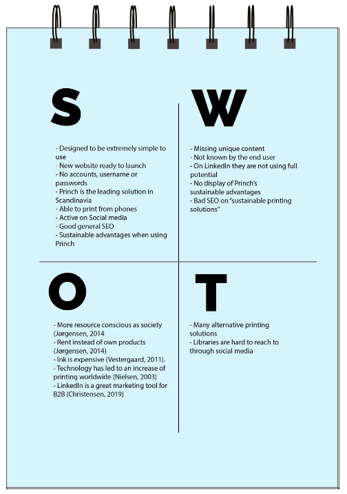
SWOT
Princh’s SWOT analysis was made, to find their strengths, weaknesses, opportunities, and threats, which were used to discover the problems they are facing.
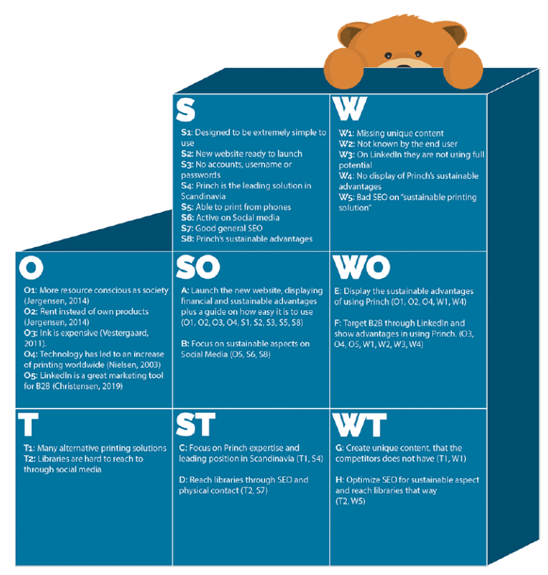
TOWS
After the SWOT analysis elaboration continued with a TOWS analysis, which helped to determine what forces Princh can use to minimize the problems.
INTERVIEWS
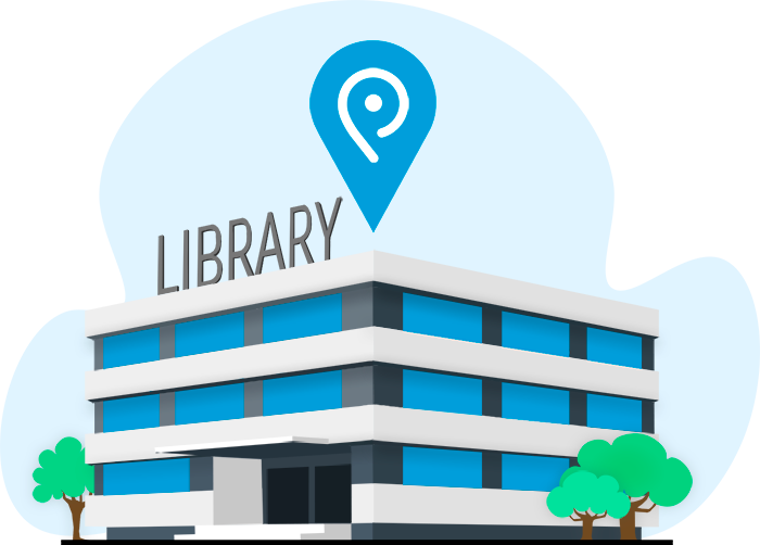
Interviews were conducted with users who use public printers. Information was used to figure out why they prefer public printers instead of having their own printer, and what qualities they find in using public printers. Additionally, three non-users were interviewed as well to figure out why they do not use public printers and what could motivate them to start using public printers and Princh’s solution.
TARGET GROUP & PERSONAS
We determined target groups and created personas that will represent each target group. Personas contain information about gender, age, demography, computer expertise, user goals and motivations.
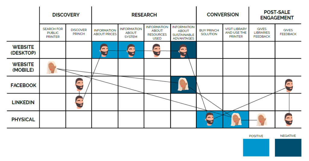
CUSTOMER JOURNEY
The personas customer journey was mapped out by dividing the personas interaction with Princh into the stages: Discovery, Research, Conversion, and Post-Sale Engagement, and identifying whether they are negative or positive touchpoints.
CREATIVE BRIEF
The design process contains a creative brief, to determine what the core of the project is, who it is intended for, what we want to achieve with it, and what has to be done.
BRAINSTORMING
Brainstorm was used to get ideas on what content should be on the site and how Princh can make the user interested and motivated, by using the brainstorming rules: Defer Judgement, Encourage wild ideas, Build ideas of others, Stay focused on topic, Present one conversation at the time, Be visual, Go for quantity.
MIND MAP
After brainstorming collection of the best ideas creates a mind map that gives an overview of the core topic and related aspects as well as the explored ideas around them.
MOODBOARD
To get inspiration and achieve the feeling that matches the project, mood board was created, which included ideas for colors, imagery, and fonts that can be used for the product. That way it can be seen if design choices work together to create the right tone.
STYLE TILE
Princh already had a design manual, which was followed, but on the subpage some additional features and design elements will be added, which make it relevant to create a style tile, to determine the visual language for the further process of product development.
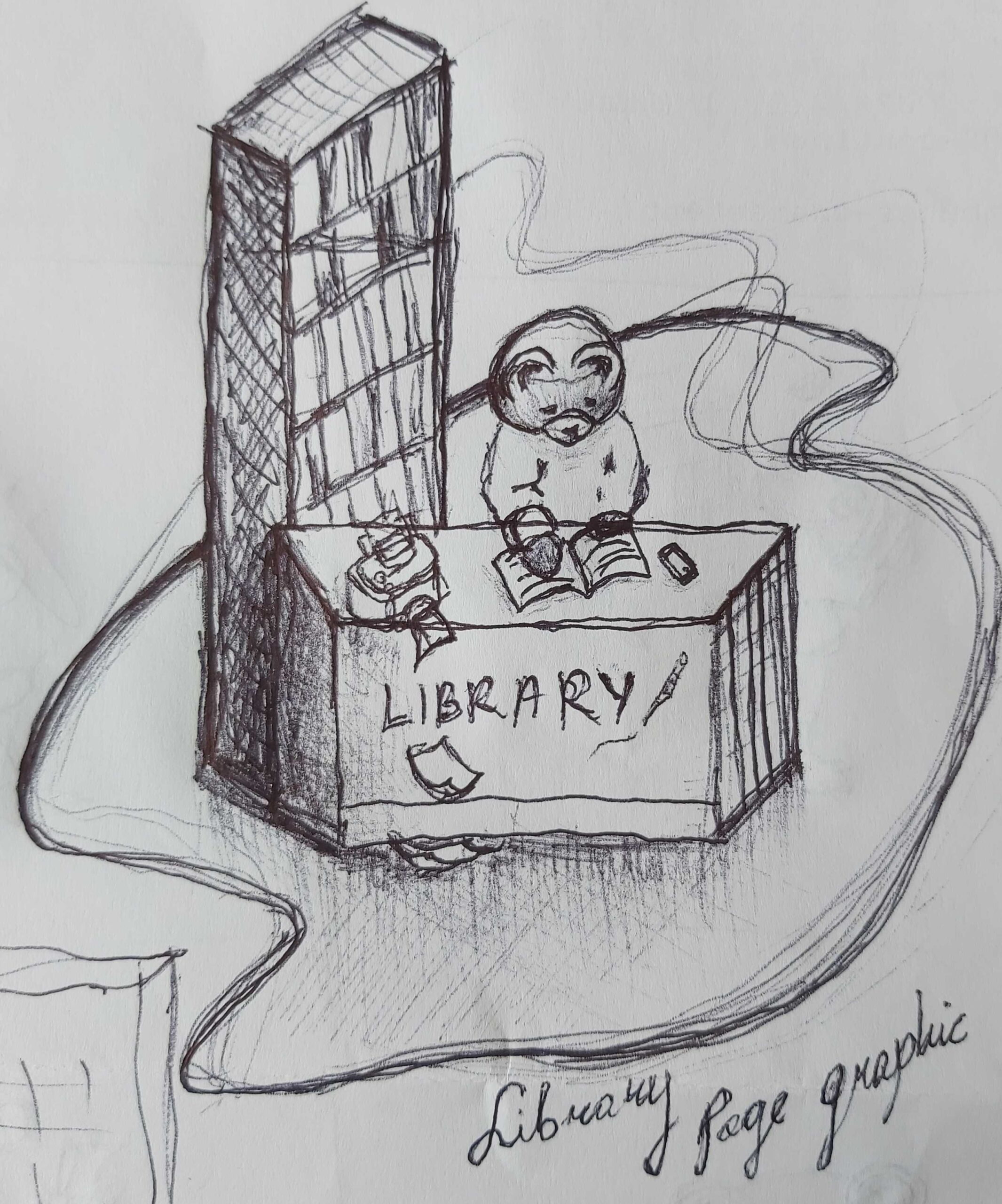
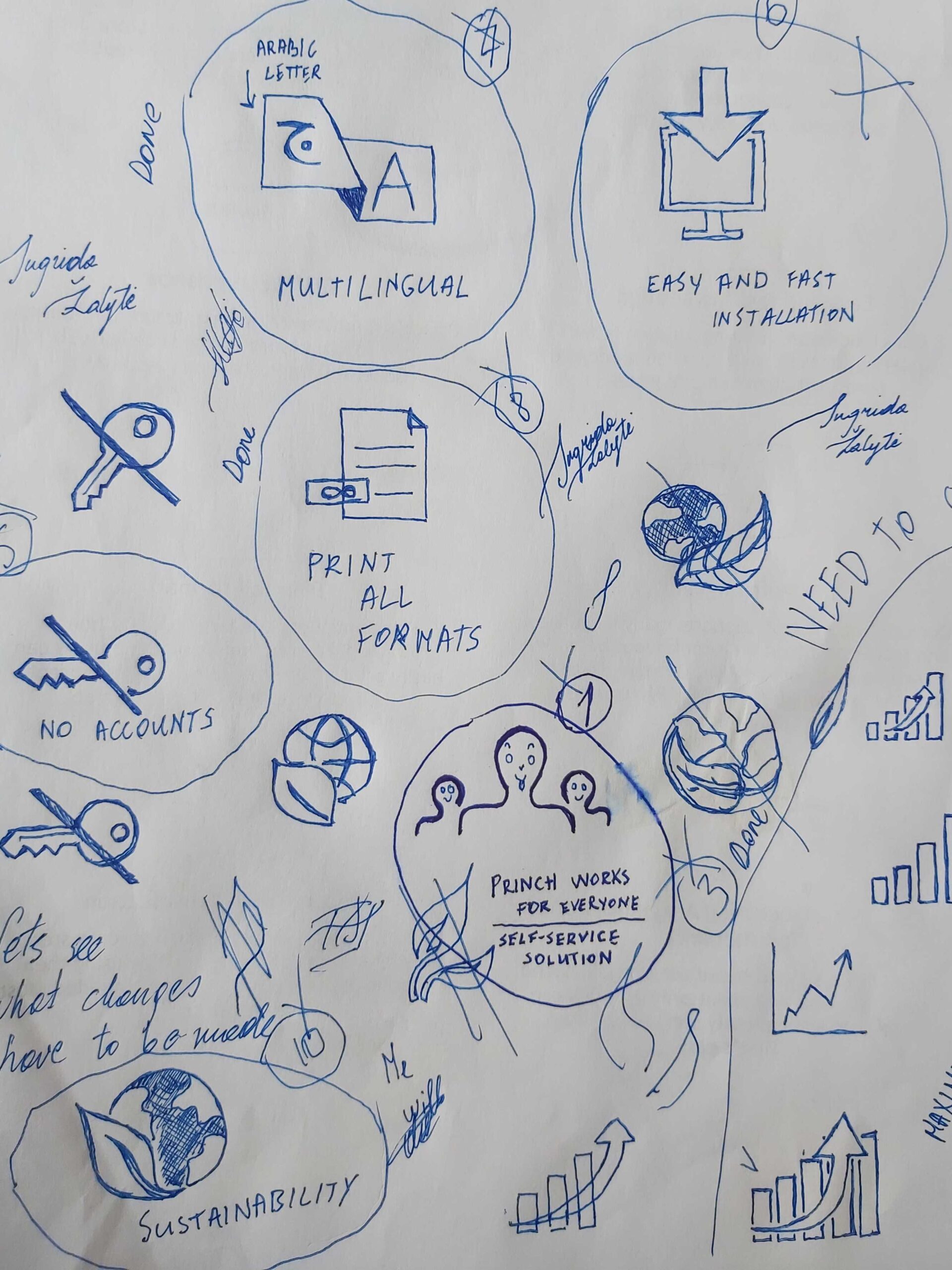
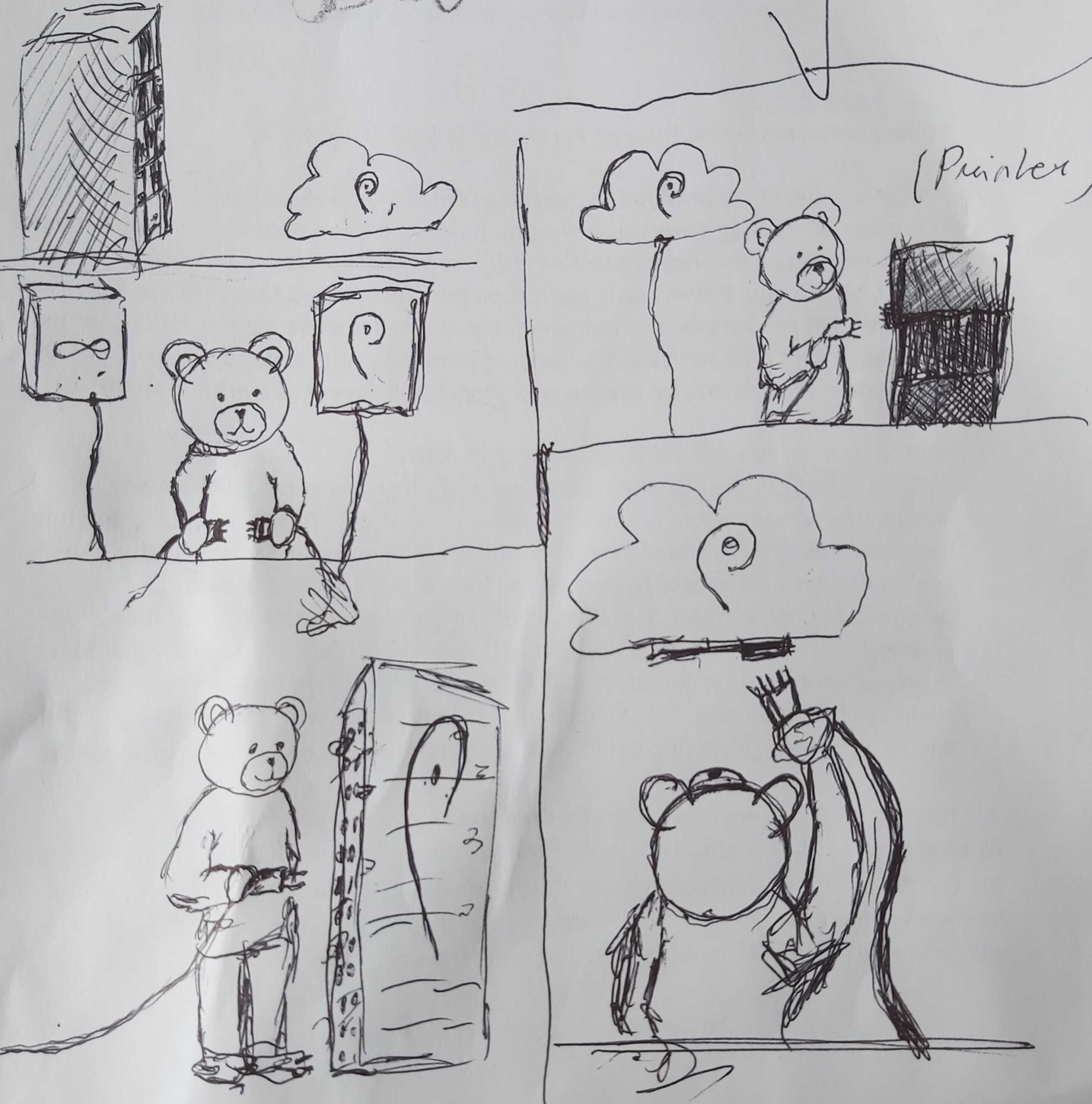
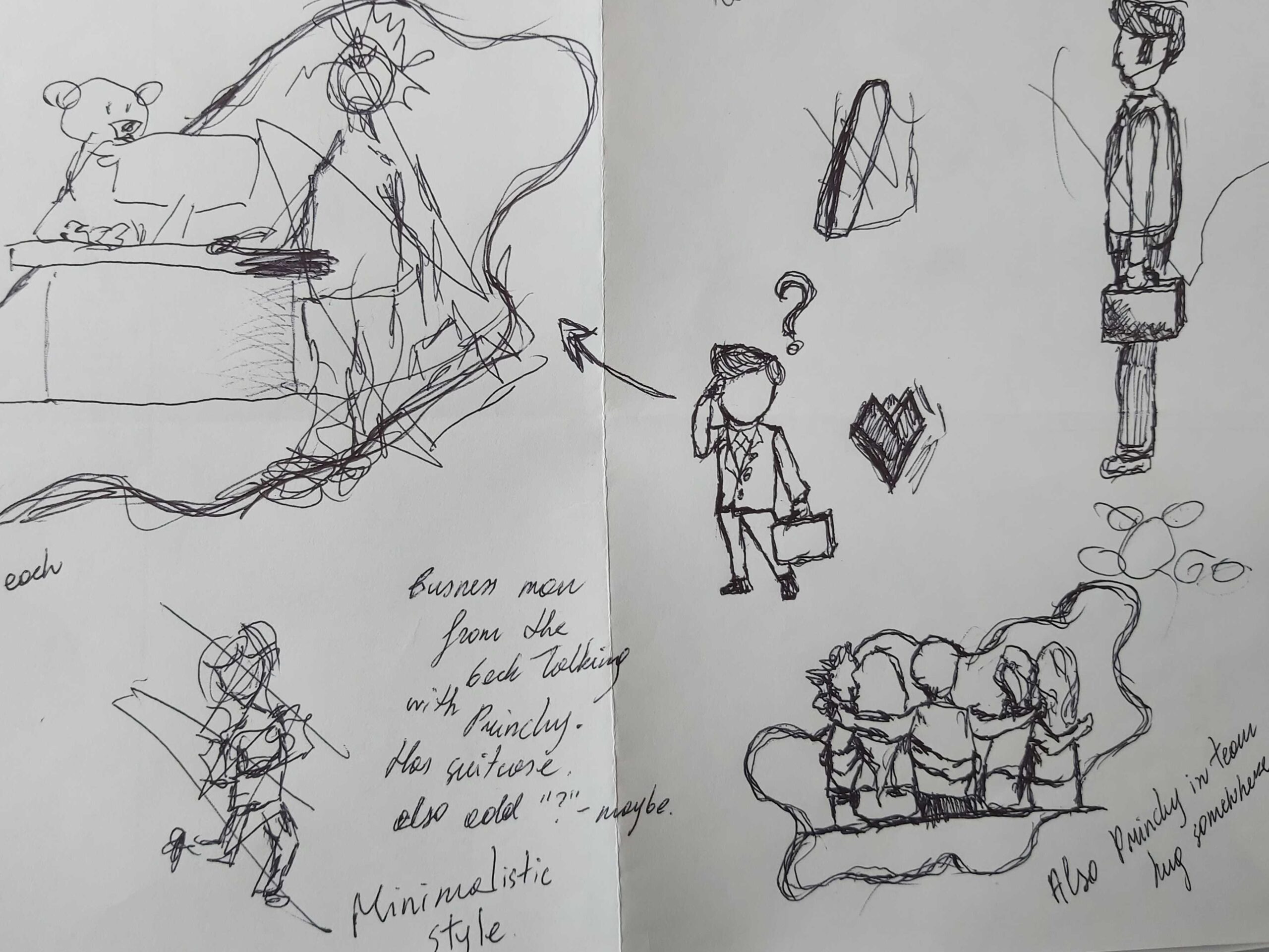
SKETCHING
For the start of the design process, sketches were made for the ideas to visualize them, which were used going forward with product development.
WIREFRAMES
We will be making wireframes to conceptualize the user interface, which allows us to get started with building the skeleton of our solution.
MOCKUPS
From the wireframes we can add styling and create mockups, that will be portraying our final product exactly, with colors, fonts, imagery, etc.
A/B TESTING
With mockups done we will do A/B testing on two groups of two people from our target group. We will present each group with a different design of our page, so we can identify which version works the best.
CONCLUSION
During competitor analysis, it was established that if a website has unique and compelling content it increases the chances that users will look more into the product offered. The unique content that was agreed on is sustainability.
Qualitative and quantitative information was acquired on the sustainable aspect by intensively searching the internet and interviewing the secondary target group. Which played a role in creating content that is reliable and credible.
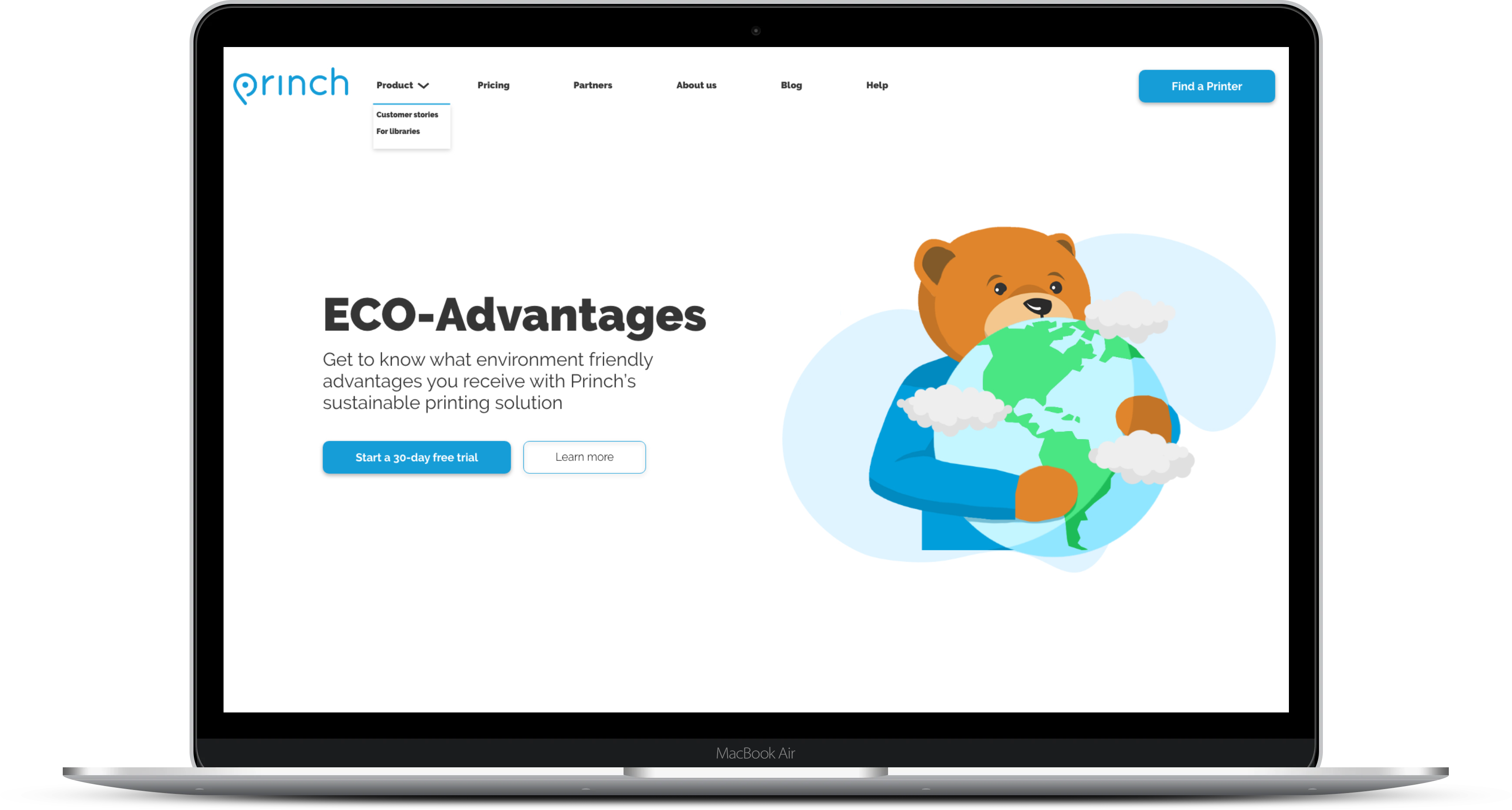
Research and the client brief concluded that Princh solve the printing waste with three main points: 1. They use payment, which their current users say prevents people from printing unnecessary pages. 2. They display print previews on their devices, which not only prevent paper waste but also ink usage, because the user can see how their page is gonna look, before using the printer. 3. Their vision is to get rid of the home printer. They are a solution for printing in public, which is a step in the right direction since we found out that 106 million printers are sold on a yearly basis worldwide and they do not last for long.
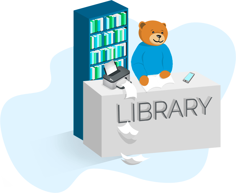
The research established two personas: one representing the main target group – librarians. The second one is representing the person who uses libraries for printing and thereby – the second target group.
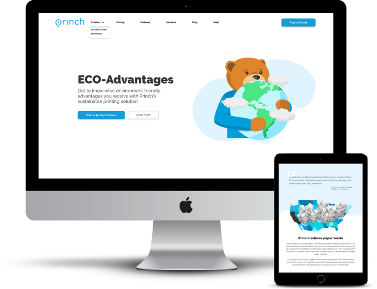
During the process of designing the subpage there was a focus on fitting the appearance to their already existing design and just creating a subpage that would also display greens – a sustainability aspect as well still emphasizing the new look of Princh. The same colors were used in their new design and displayed the content in a way that is coherent with their new site. To elaborate on the design for the page after all the stages from brainstorming to mockups, A/B testing was done.
Princh can promote its sustainable printing solution by displaying the data previously mentioned on the subpage that is design-wise coherent with its new website.
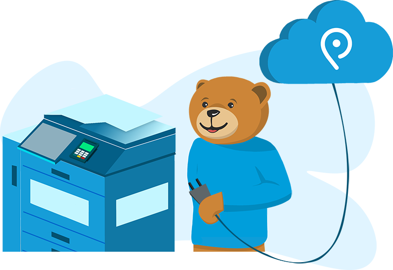
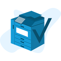
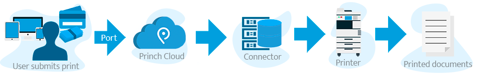
Princh is the leading printing solution in Scandinavia and has customers across Europe and the US handling millions of print jobs. Based on the idea of the sharing economy, they are building a global network of publicly available printers, with the idea to get rid of home printers. Their solution makes it easy to find a printer nearby and print from phones, tablets, and laptops and pay for the service electronically. The solution that Princh made is used by libraries, universities, retail, shared workspaces, and hospitalities.
MY CONTRIBUTION – Graphic Design
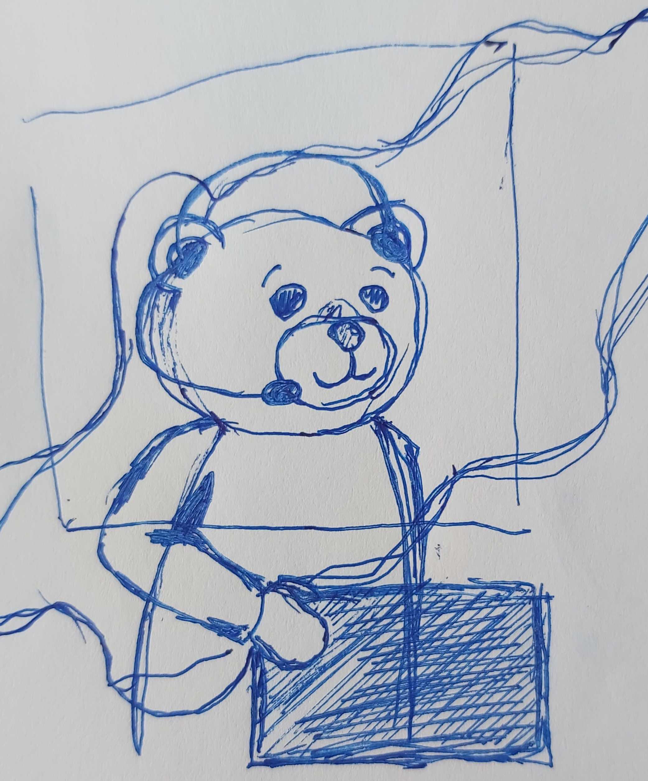
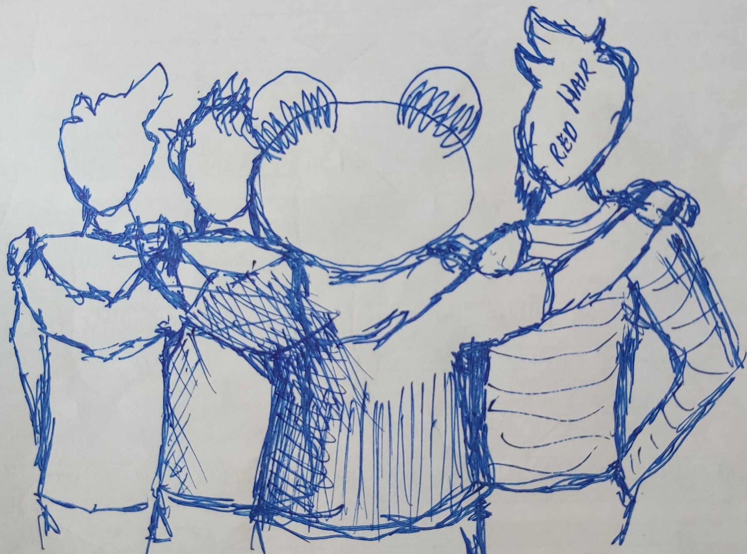
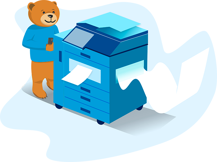
I was the only Graphic Designer in the company, so all the graphics and illustrations had to be made by me. I had to sketch my ideas to my supervisor so they would be approved for development. I was working with Content Creation and Graphic Design for the new Princh website.
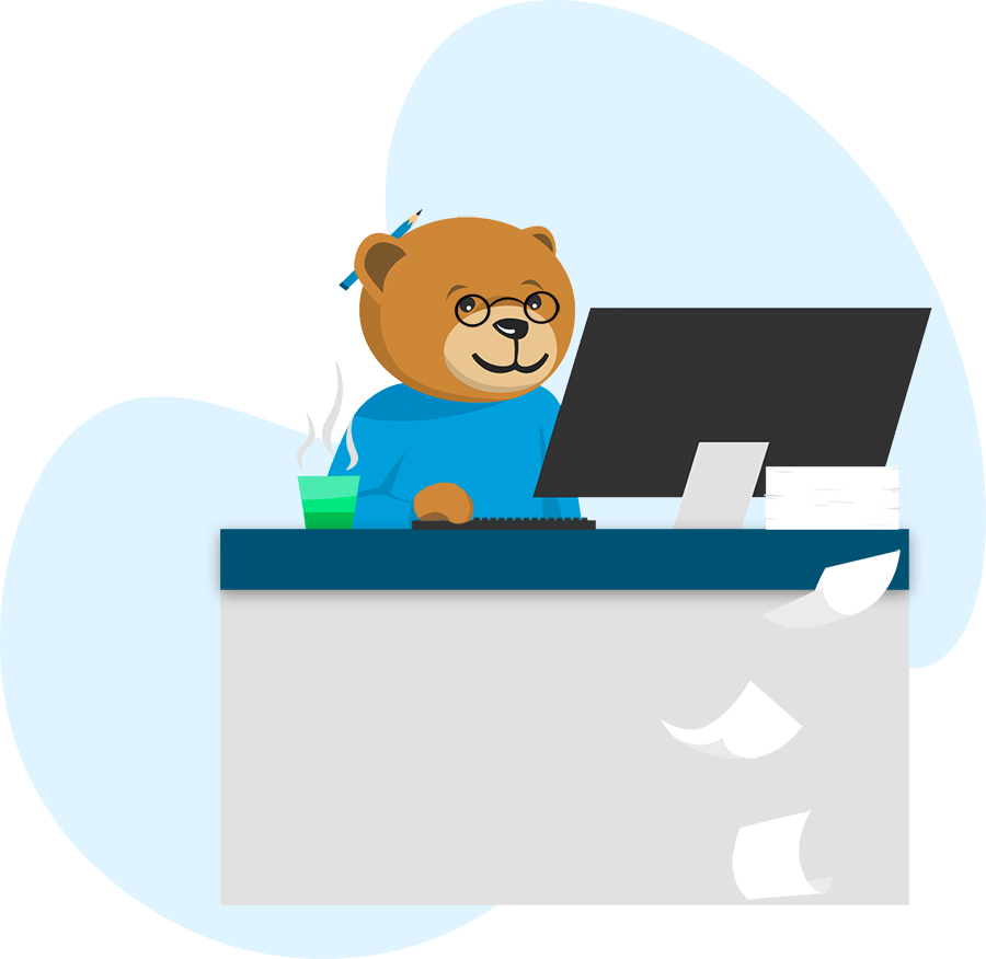
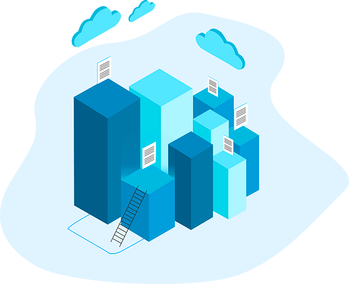
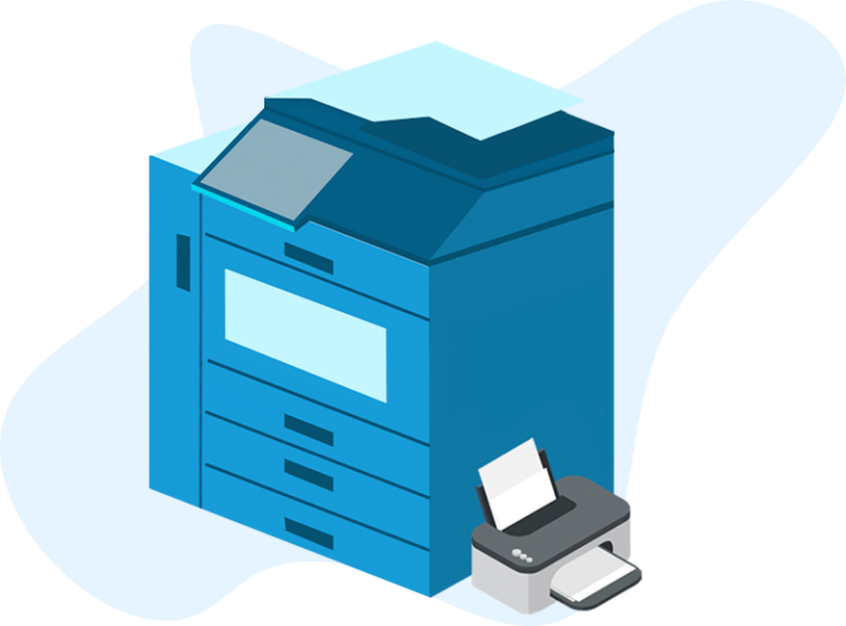
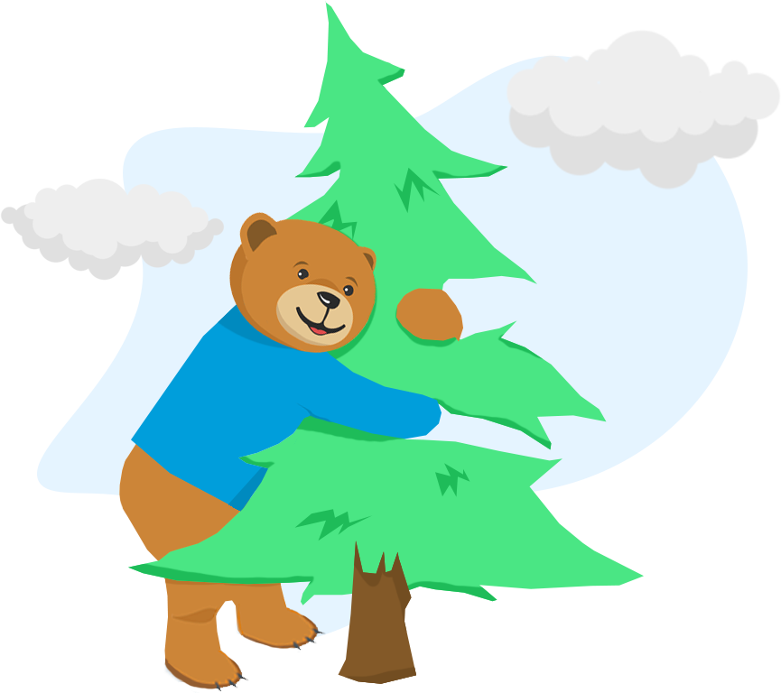
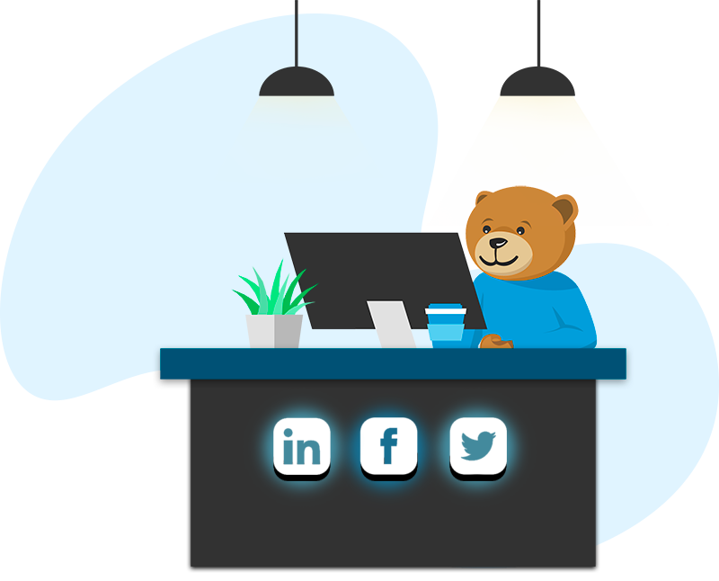
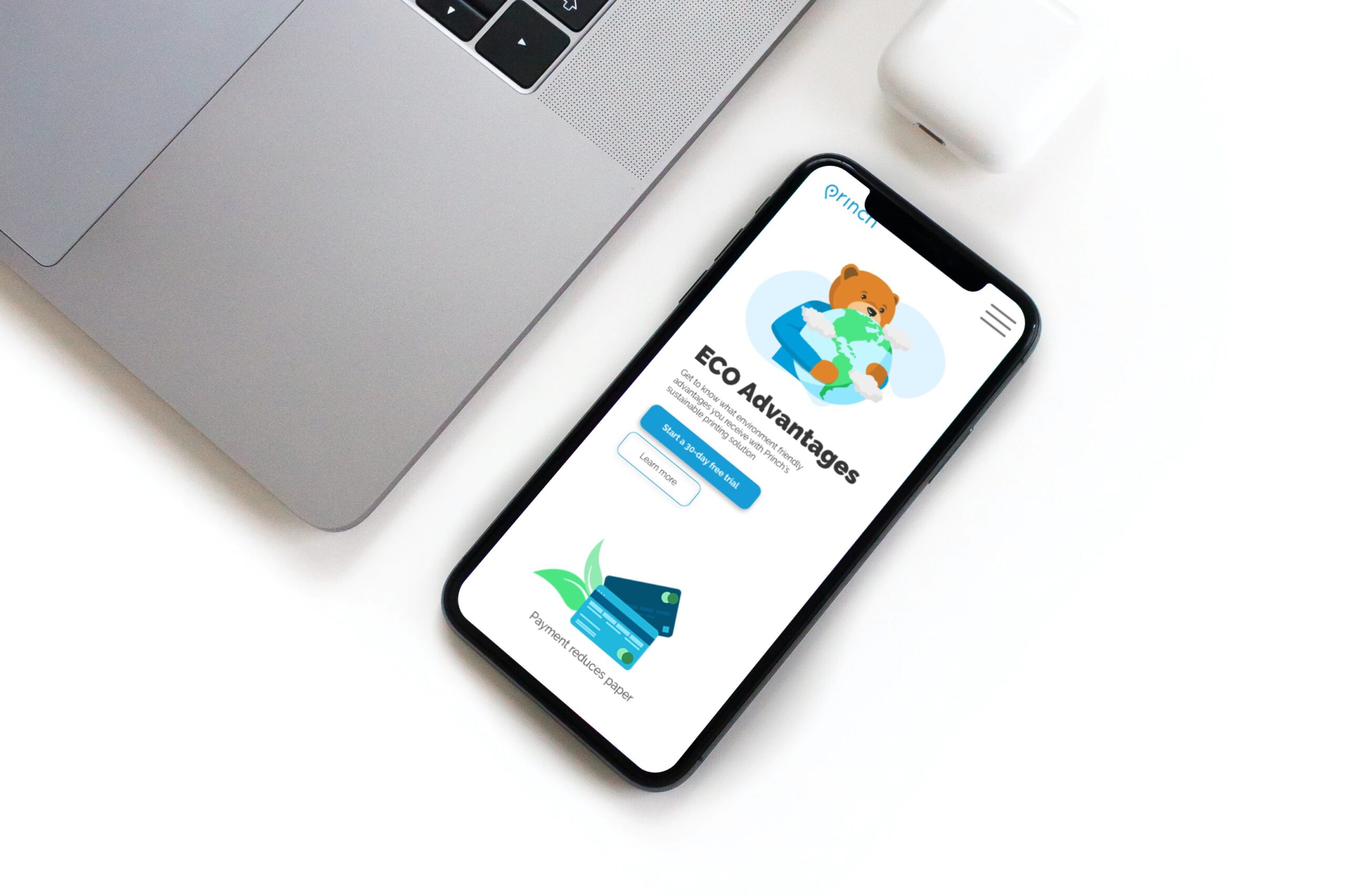
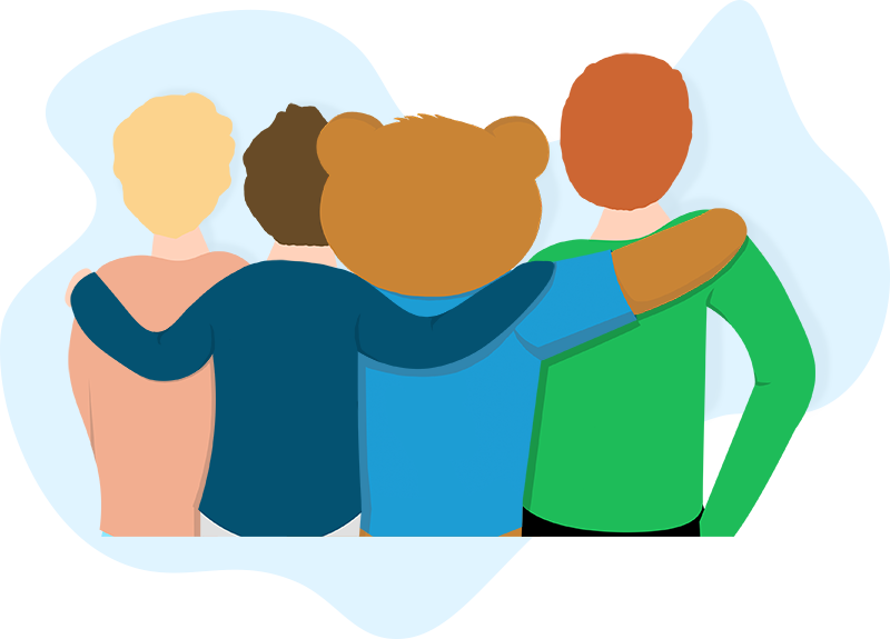
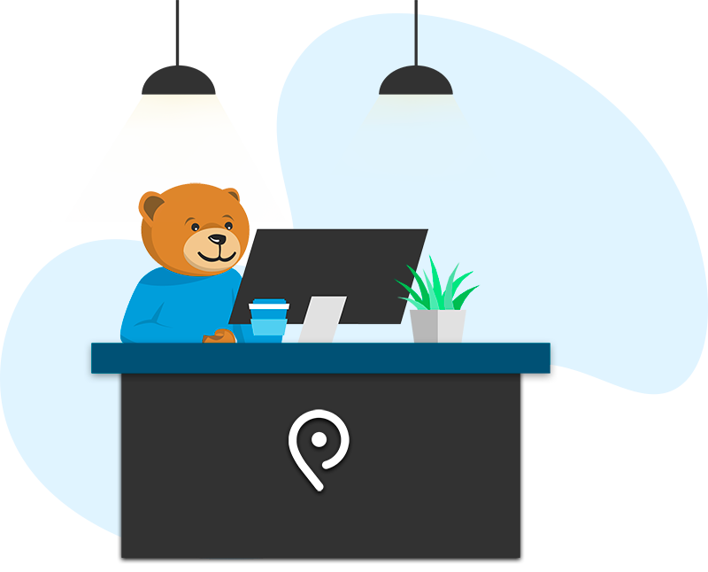
I had to make new illustrations with the mascot “Princhy” and others. The illustrations next to the text had to be self-explanatory. By being the only Graphic Designer, I was the only one to do that job which made me more confident in my skills.
Deadlines and workload were extremely intense which improved my time management skills and I was able to deliver everything at the agreed-upon times.
The whole new look of the website is built using my illustrations and can be seen here.
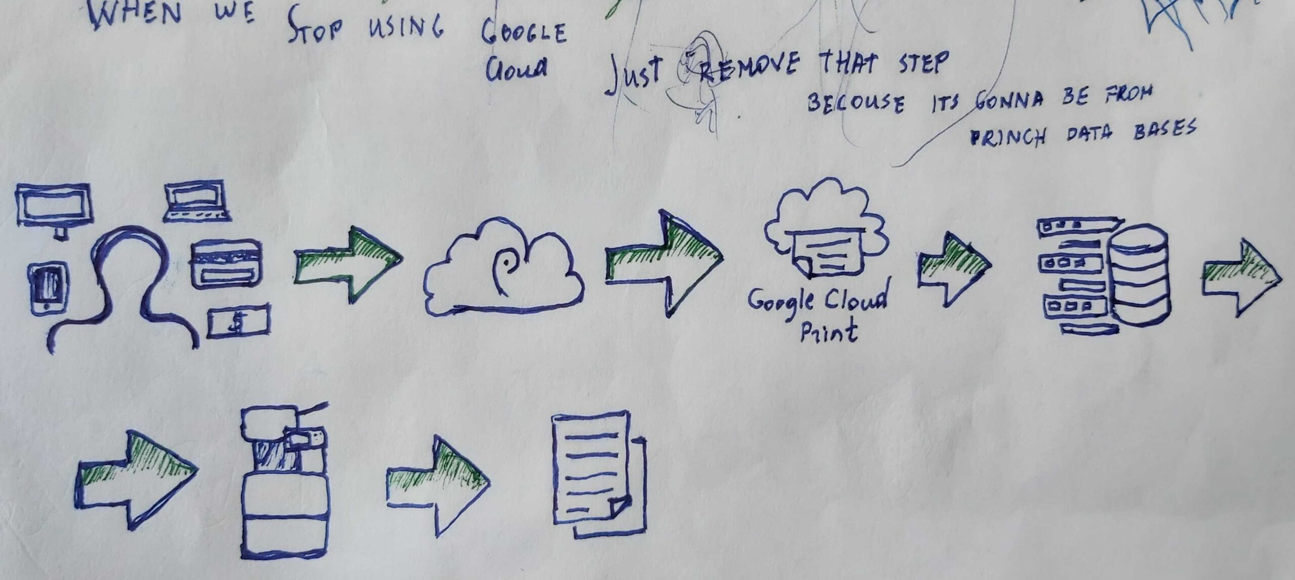
Sketching
Sketches & Ideas
Sketches of my ideas to get approved for further development